
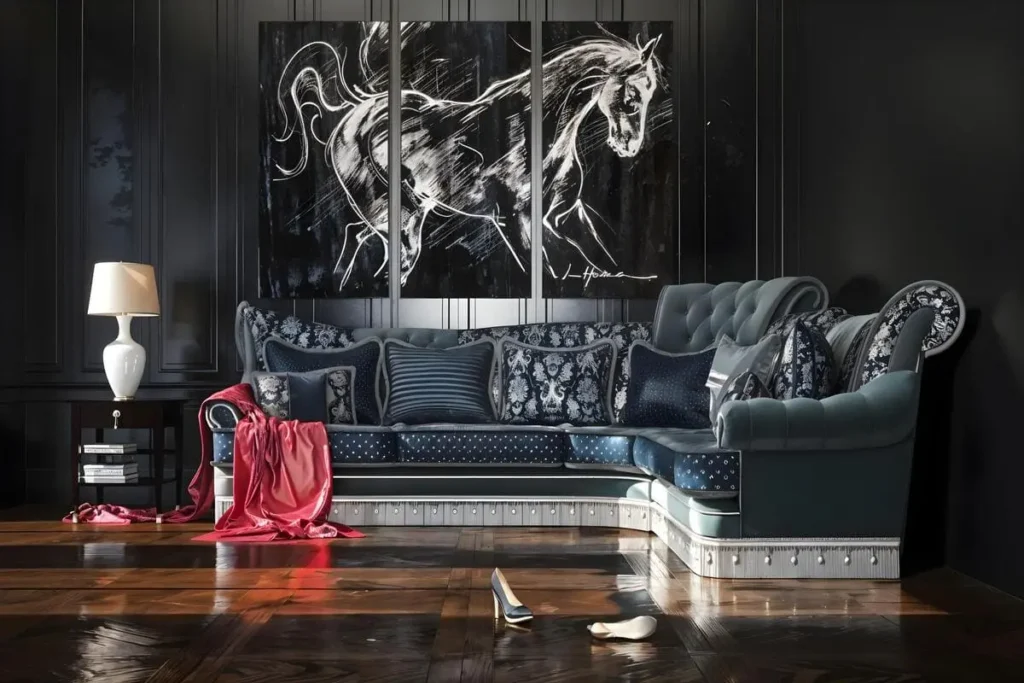
Walls are where many moody rooms go wrong. People paint a charcoal accent wall, then discover that the rest of the room cannot carry the weight. Designers and professional painters name overly dark accent walls among the choices homeowners commonly regret, often because the wall came before the room plan. Moody wall decor is safer. Art can move or come down. Paint creates a weekend project in reverse.
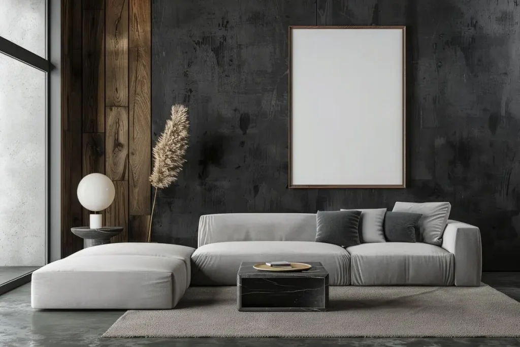
What Actually Makes Wall Decor Moody?
Just black frames will not do the trick. Colors, contrast, textures, and subjects combine to create the atmosphere. Consider oxblood, forest green, tobacco brown, midnight blue, or murky teal rather than a flat field of black.
The subject also counts. Shadow botanical is atmospheric because of lighting and composition. Even bright poster in black frame looks bright. The thing that makes wall decor moody is the balance between shadow and a clear focal point: a pale flower, a flash of water, or the face in an old portrait. The room should feel layered, not starved of light.
Choosing Art That Reads Moody
Subjects that are guaranteed to have depth are always your best bet. Dark flowers give you color without making the piece too sweet. Landscapes will only work if there is low, flickering light in the sky, water, or trees. For abstract art, you need something with depth as well as some room to breathe.
For dark and moody wall decor, ask one question: what should I notice first? The answer may turn out to be a face, a pale flower, a streak of ochre, or a horizon line. This is what provides the eye with some sort of landing place.
Use the room as your filter; pick up one color in the carpet, bed covers, tiles, or curtains and look for artwork that echoes this in a darker shade. For example, a cushion in rust may guide you towards brown-red abstracts, and olive bed covers may lead to some forest scene from years gone by.
When purchasing art online, shrink the image on your computer screen to see whether its key element can survive at this tiny size.
Frames and Mats Change the Mood
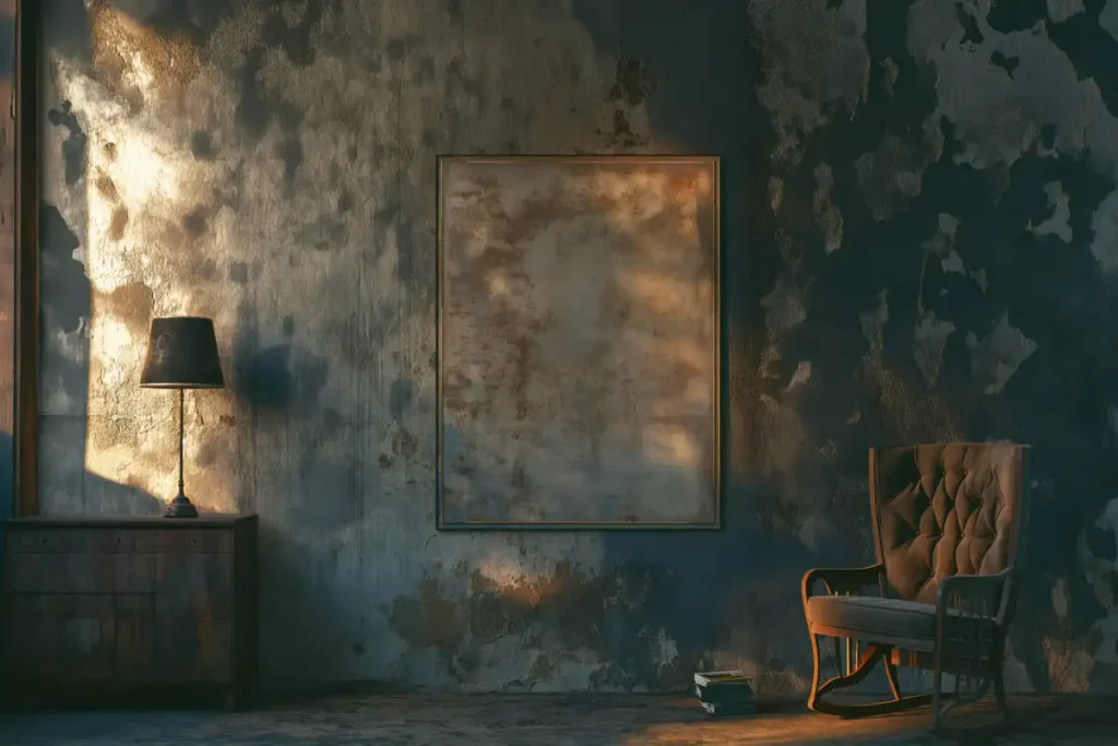
The right frame may turn the exact print into a stern, warm, antique, or calm artwork. Thin black frames are appropriate for photographs and modern abstracts. Large black frames carry more visual weight, so save them for big artworks that can bear them.
Brass and antiqued gold help to illuminate and avoid turning the dark piece into an abyss. Dark wood gives a more gentle look to the artwork and is great for portraits, landscapes, and botanic subjects.
Mats determine the distance between the print and viewer. No mat turns the picture into a very immediate one. Cream makes it airy, while green, brown, charcoal, or wine color draws the print into itself. For all middle-sized artworks, begin with a mat of two to four inches wide. In case both the artwork and the frame are dark, use narrow cream or linen mats in-between.
Placement and Scale Rules That Work
The problem of scale is more difficult to solve than that of style. Small print appears neglected, whereas a large gallery wall may overwhelm the furniture beneath.
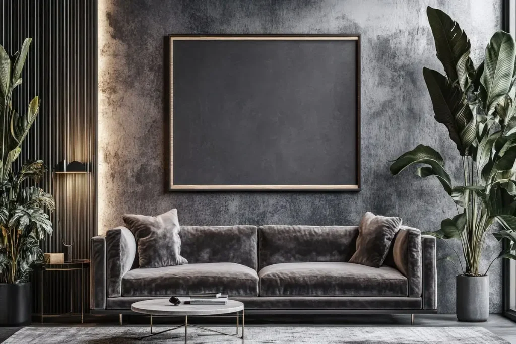
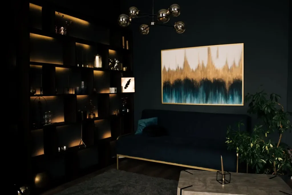
Hang a painting over a sofa at two-thirds to three-quarters of the sofa’s width. Place the bottom of the frame six to ten inches above the back of the sofa. A 90-inch sofa could take a composition of 60 to 68 inches wide.
Also, when hanging a painting above a bed, treat the headboard as your reference point. Two-thirds to three-quarters of the headboard width could work, leaving six to twelve inches space between them. For moody bedroom wall decor, one wide landscape or a pair of substantial pieces often feels calmer than a busy grid directly over where you sleep.
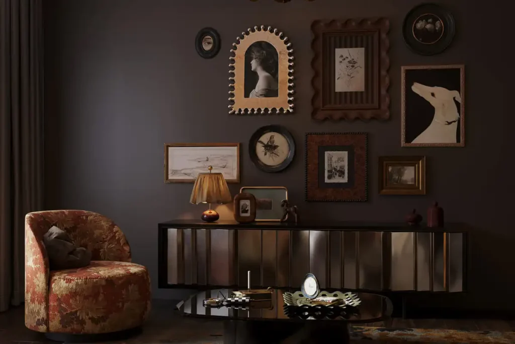
A statement piece succeeds where there is pattern in the room, books, or sculptured lighting. Gallery walls are good for simpler rooms or a collected look. The collection should be treated as one big rectangle, allowing gaps of 2 or 3 inches between artworks. First, lay out the collection on the floor. The visual center of the artwork should be at about 57 to 60 inches above the floor unless some furniture requires a lower placement.
Do not add artworks just to cover any gaps. Five good spacings may make more sense than twelve random artworks.
Pairing Art With Your Wall Color
Light walls have their uses too. Putting dark art against a warm white or pastel-colored wall made of pale stone, taupe, or plaster provides almost 80% of the drama, without any need to repaint the wall itself. This is often the easiest route to dark and moody wall decor in a rental or a room with limited daylight.
On a dark wall, a spot within the picture, a light mat, or a bright frame might be found. Brass, warm silver, burl wood, and medium oak may provide a border to the picture. In the case of a black frame, select a finish that differs from that of the wall. The difference between satin and matte finishes may be enough.
Generally, wall and painting colors work best when the painting shares an undertone rather than an exact match. A blue-green wall goes well with stormy blues and tarnished gold tones. Wine walls match with tobacco brown, faded pinks, or cream walls.
Room-by-Room Quick Hits
- For moody bedroom wall decor, keep the area near the bed restful. Try one landscape, a restrained pair, or a shallow ledge. Save expressive portraits and crowded arrangements for a side wall.
- Moody bathroom wall decor needs materials that tolerate humidity. Try prints behind acrylic, sealed canvas, ceramic, or metal. Keep valuable art out of poorly ventilated bathrooms. Pair it with a styled shelf above the sink for a layered look, not just wall art alone. See it pinned here.
- For the living room, scale the artwork based on the sofa not the wall. Also repeat one of the colors in the textiles and use a picture light for lighting the artwork.
- One single image, be it a portrait, map, or botanical, is enough to give the entryway atmosphere. Just make sure you include a mirror or lamp too.
You can carry the bedroom look onto the opposite wall, where a detailed arrangement will not compete with the headboard. For moody bathroom wall decor, a small pair often looks better than one undersized print floating over the toilet.
Renter-Friendly Ways to Hang Art
Big artwork can rest against a console, chest, mantelpiece, or low shelf; ensure that the piece is well-secured to avoid tipping. Picture rail systems make it simple to switch pieces without having to drill holes for every piece you hang. Adhesive strips can be used for smaller items where appropriate.
Frequently Asked Questions
Not usually. A well-proportioned dark object can create depth for a small space. The problem arises when the combination of dark art, heavy furniture, poor lighting, and lack of contrast occur.
A number is not needed. It is best to have between three and seven items. Make sure there is uniform spacing and varying sizes so that the collection is cohesive.
The black feels hard, the wood feels soft, and the brass feels warm and reflective. Let the room and the artwork decide.
Yes, bright rooms will offer the contrast that is required for dark paintings. Repeat the color that is in the painting somewhere else.
Start With the Part You Can Change
Great wall art gives your room dimension without committing to a paint color choice. Start with one well-proportioned piece, select its frame within the room, and only add what is needed. Find out more in our comprehensive guide to mood rooms below.